Mentorbarn
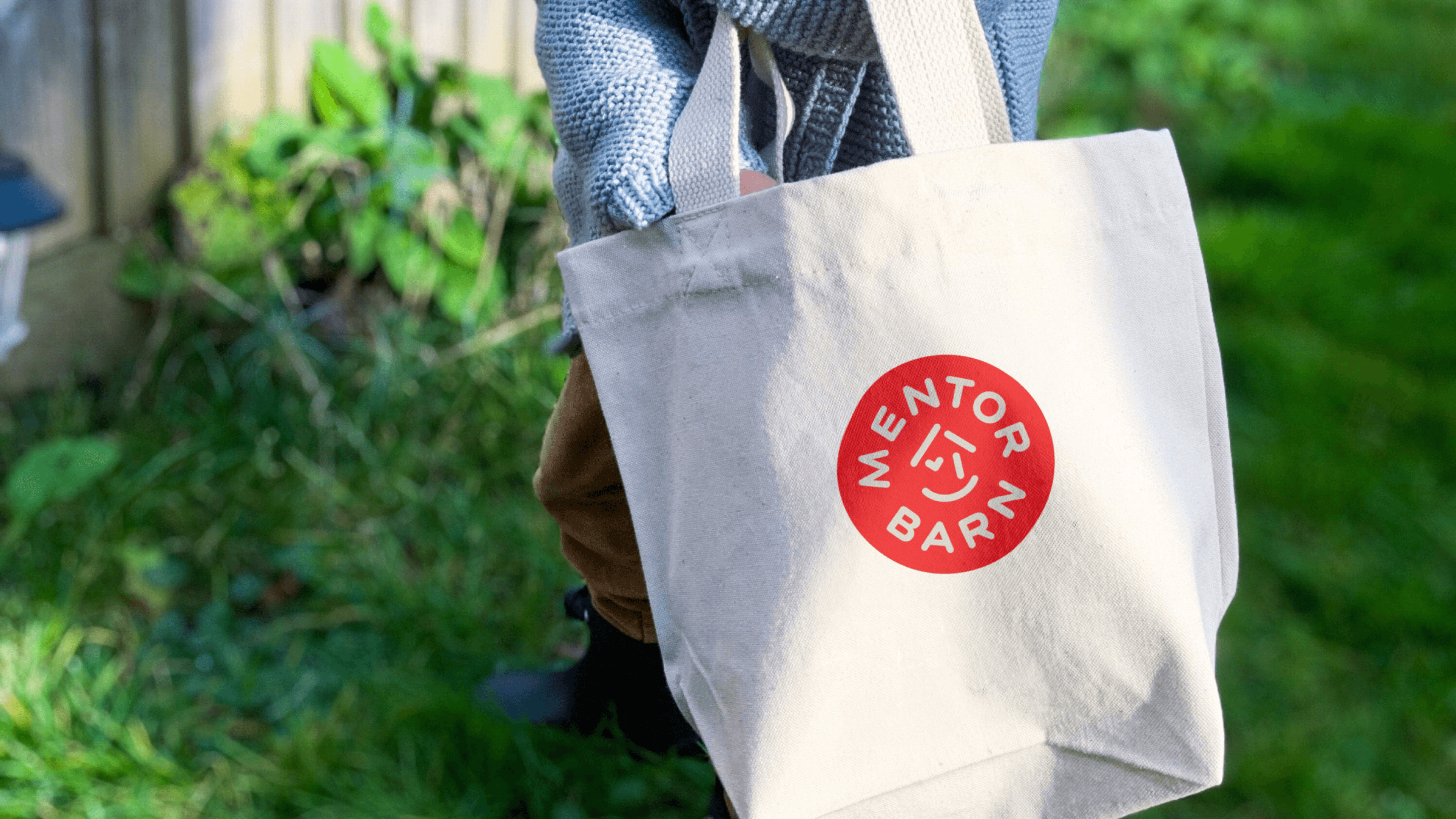
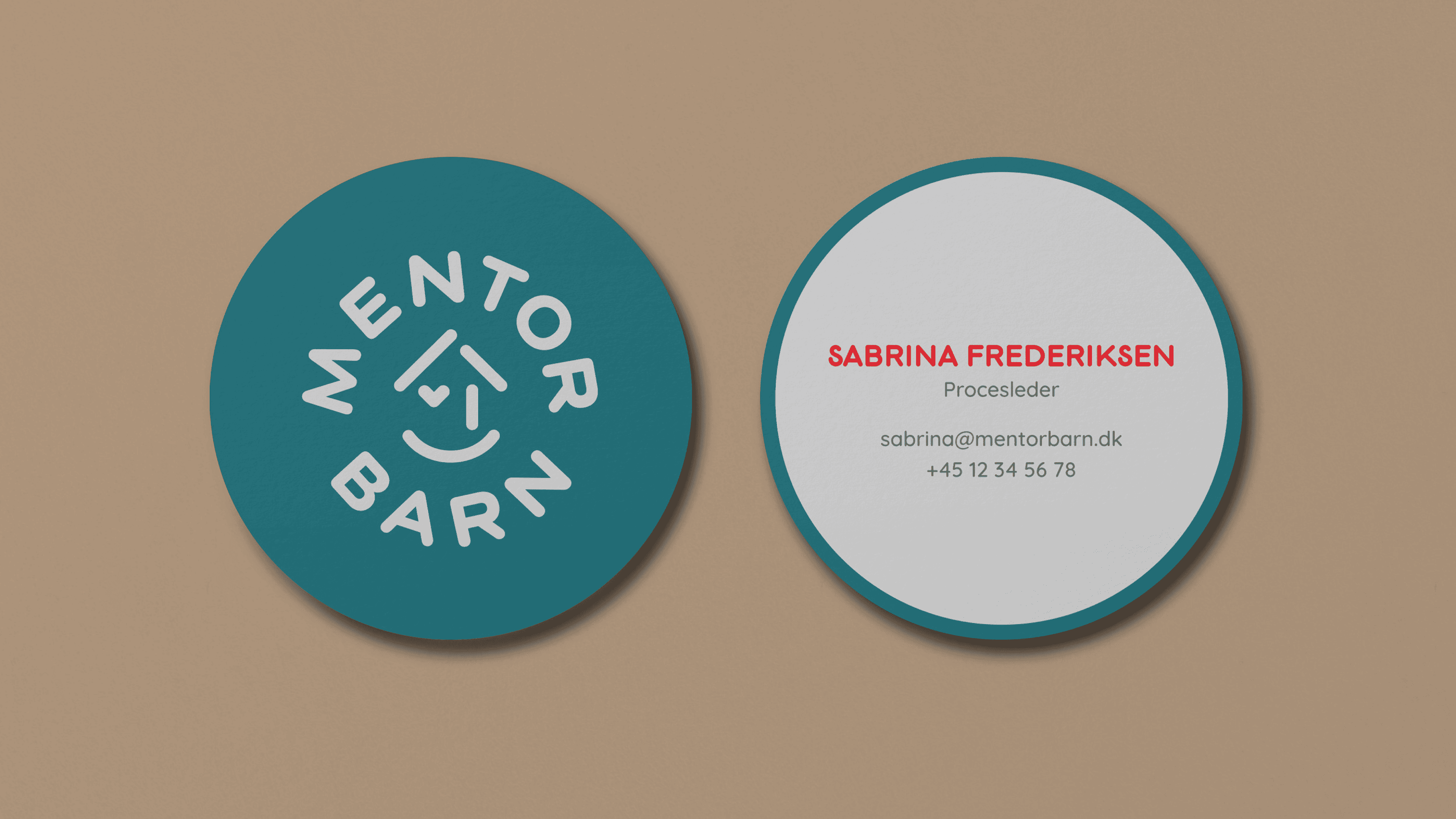
During my time at AM Copenhagen, I had the opportunity to work on redesigning the visual identity for Mentorbarn, an NGO dedicated to matching up vulnerable children with families as a mentorship program. The organization needed a simplified identity that their team could easily manage without a dedicated designer. The goal was to make a more accessible identity and practical for everyday use. Their previous design was too complicated for them, making it difficult for the team to maintain a consistent brand presence. We decided to focus on the circle as the main design element, symbolising friendliness and inclusivity. This shape, which was taken from the existing logo, was used as the main shape for layouts, providing a unified visual language that was easy to implement. the existing logo and fonts were kept, but we introduced new colors, which where inspired by the homes of the host families, and simplified layouts to modernize the brand. We created brand toolbox with clear examples of how to use colors and layout throughout their touchpoints, allowing Mentorbarn to create their own content. Given that Instagram is their primary communication platform, we developed a versatile design system that offered creative flexibility while ensuring a consistent look and feel. Credits: This project was made during my time at AM Copenhagen, and was a collaborative effort with Simon Nellemann.
Client
Mentorbarn
Delivarables
Identity Design, Branding
Role
Graphic Designer